Mabel
2026
The Mabel App: From Zero to MVP
Overview
About Mabel
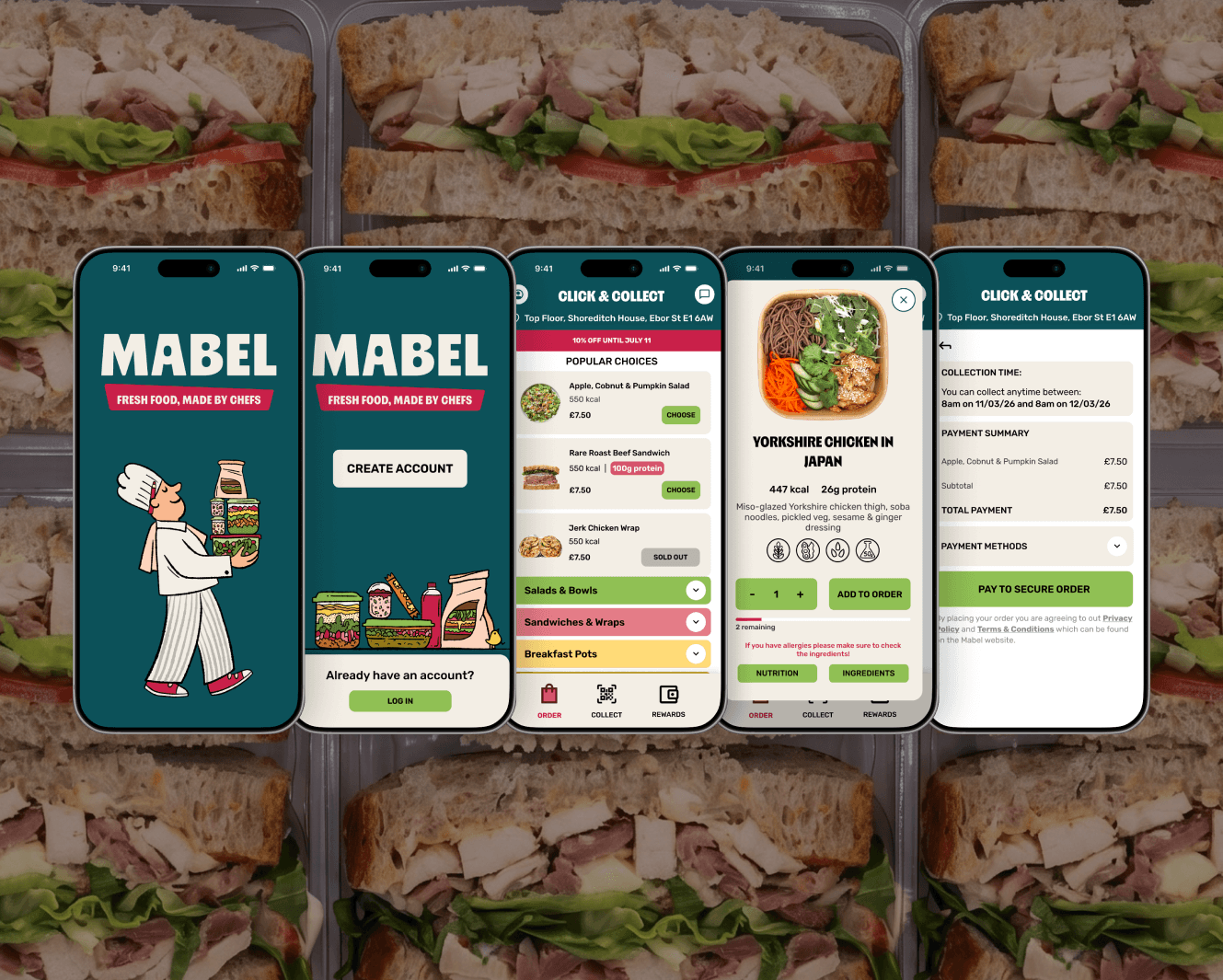
As the sole product designer, working alongside the founder and development team, I designed the MVP for Mabel's app. Mabel is a food-tech company selling chef-made grab-and-go food through vending machines placed in high-footfall spaces like co-working offices, universities and train stations. The app lets users browse the menu and place click-and-collect orders ahead of pickup. The pilot machine launched at Shoreditch Exchange, a co-working space in East London.
Problem
Four constraints shaped the design challenge:
Timeline
A short funding runway meant the app had to go from brief to working proof-of-concept fast, so further funding rounds could be secured.
Perception
Vending machines aren't associated with good, healthy food. The app had a role to play in shifting that perception, not just enabling transactions.
Two order channels, one machine
Users could order via the app or in person at the machine — with in-person orders taking priority if both happened at once.
App-to-hardware sync
The app had to talk to the machine's software and hardware via an API, with an unavoidable sync delay and occasional stock mismatches that couldn't be fully engineered away.
This last constraint created the sharpest design problem: how do you keep ordering fast and frictionless, while still giving the backend time to confirm the item is actually available — and avoid the user placing an order for something that's already sold out?
Solution
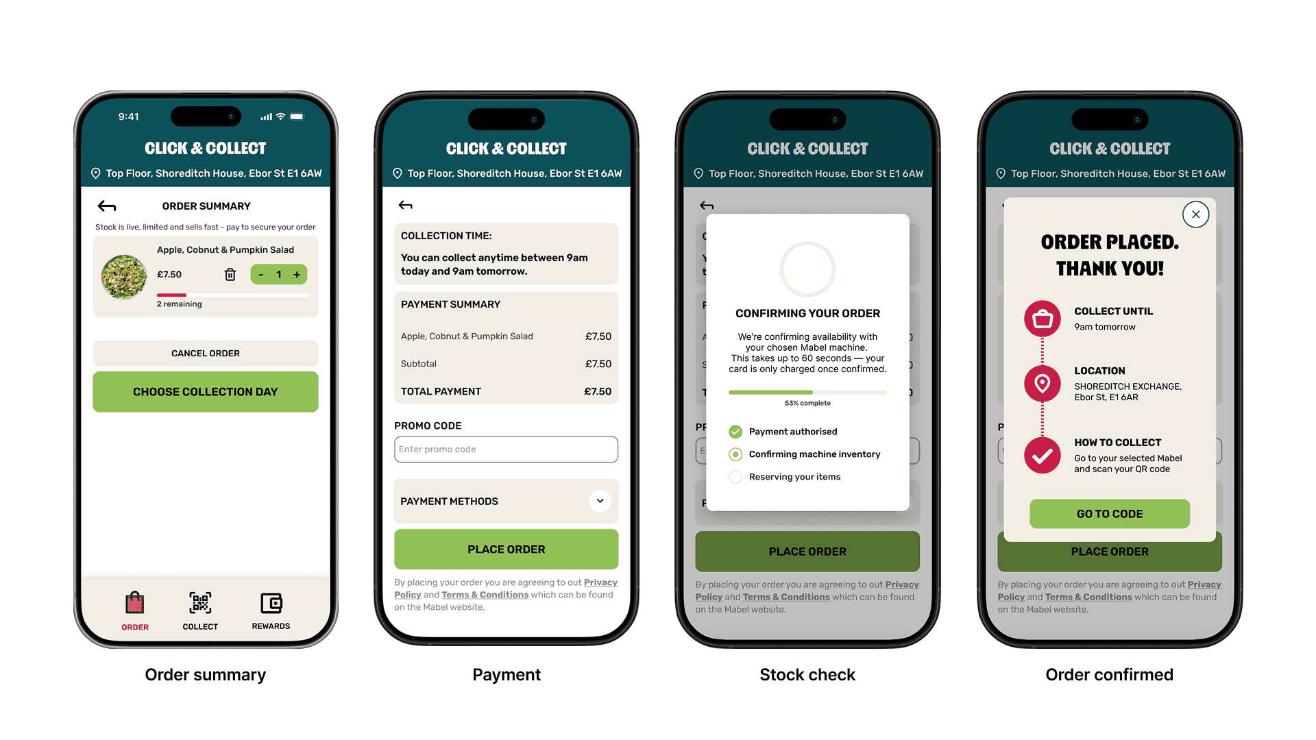
My solution was to borrow a mental model users already trust. I designed a confirmation state modelled on Uber's "finding your driver" screen — the user's card is placed on hold (not charged), while the app confirms availability with the machine, then only completes the charge once confirmed. It reused a pattern people already understand, which turned a technical limitation into something that felt intentional rather than broken.
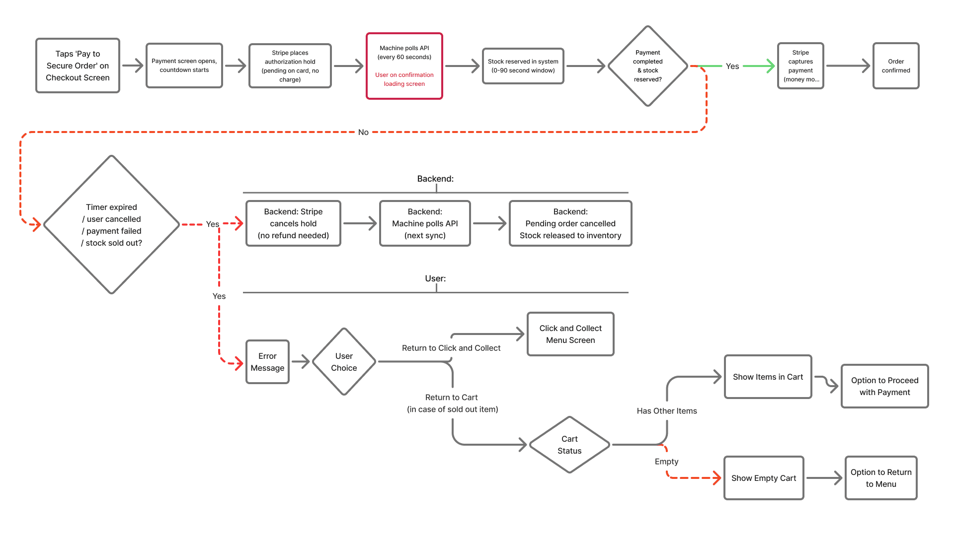
Early research pulled from two places: comparable ordering apps for general UX inspiration, and Uber's confirmation flow specifically, as the direct reference for solving the availability-sync problem. This is also where I mapped user flows — the end-to-end ordering journey, and a detailed flow for the confirmation step, where the app-to-hardware handoff needed to be airtight.
High level flow from app launch to order collection:

Order specific screens:
Order flow focusing on confirmation step and error management:
Overall App Development
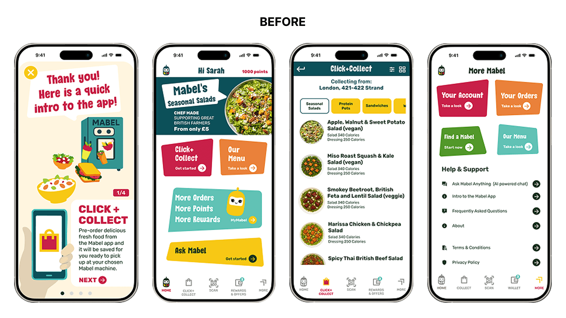
Alongside the specific challenges posed by the multiple ordering channels and hardware synch, the overall app design also needed to be addressed. The founder's initial vision needed significant rework to align with current UX principles, accessibility needs, and brand consistency. In collaboration with the founder and the development team, I restructured a significant portion of the flow and revamped the entire UI with the goal of making it as simple as it could be and only as complex as it needed to be for MVP stage.

Lessons
The biggest lesson wasn't so much a design one but rather an operational one. Shipping an MVP in under three months, including development, meant coordinating across three parties with very different working styles and priorities: a founder moving at startup speed with a constantly evolving vision, an overseas development team, and an international hardware supplier responsible for the machine itself.
Keeping the project on track meant translating between all three — turning a shifting brief into something stable enough for developers to build against, while making sure design decisions stayed realistic given what the machine's hardware and API could actually support. Managing that many moving parts, across time zones and disciplines, on a hard deadline, taught me as much about communication and prioritisation as it did about product design.


